Showing posts with label Friendship. Show all posts

July 11, 2010

Practicing Creativity with Iris Folding

I finally found some time last night to play around with those sketch challenges Courtney has going on her blog.  There are four sketches and up for grabs is a $50 gift certificate for Practicing Creativity Designs (PCD).  Wouldn't that be handy?  I'd be able to add the last three stamp releases to my collection....and buy some May Arts ribbon as well.

Anyhow with this box sketch I was inspired to give Iris folding a try.  It's not very hard once you figure out a couple of tricks like the fact that you might need wider strips to start the pattern (at least if it's a larger pattern).  Also if it's thicker pattern paper you're using then you can't do as many layers as you might want to.  I'm proud of this card not only because I tried something different but because I managed to incorporate three different papers from three different manufacturers and I think it turned out wonderfully.

I have no idea why I came up with something for Saint Patrick's day but I came across my PTI Luck of the Irish set which I hadn't used yet and I was feeling pretty LUCKY.  Of course because this was a PCD challenge I had to incorporate one of Courtney's sets.  I used the For the Love of Dots to frame my art work.  There's always room for a little PCD =)

Elements

Paper: Very Vanilla, River Rock, Early Bird dp (Cosmo), Nook & Pantry dp (BG), Kaisercraft dp
Ink:  Always Artichoke
Accessories: cutting blade, iris folding pattern, foam tape, 1 1/4" circle punch
Stamps: Luck of the Irish (PTI), For the Love of Dots (PCD)

June 28, 2010

Make You Smile =)

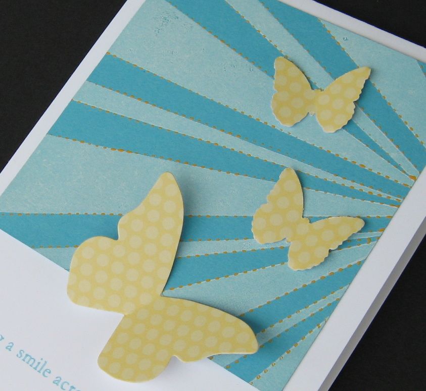
Hello everyone!  I thought I'd try and make you smile after my dreary last post.  This is for the current CAS-tastic challenge to use yellow, blue and a neutral of your choice.  I chose white for a bright and dreamy like look.  What do you think?  The butterflies are made from the left over paper from the SU! Princess party pack. I love So Saffron but I don't have very much of that colour so I'm making do with scraps right now.  It works really well the Tempting Turquoise (also from my scrap bin).

I got a chance to play with the sun rays from one of my favourite Practicing Creativity stamp sets "You're dandy"  I also took a chance and used acrylic paint and a pattern tracer to outline the rays.  I really like the affect....it's not too much but adds to the texture and colour.  The layout inspiration came from the current fall-to-layout sketch on the Clean and Simple blog.  Thanks for the inspiration ladies!

Hope you are all having a fabulous week.  I managed to make four cards this weekends so, unless things get really crazy around here I should be back everyday with something new.  Happy Crafting.

Elements:

Paper:  Whisper White, Tempting Turquoise, So Saffron dp
Ink: Whisper White Craft, Tempting Turquoise Craft
Accessories: Yellow acrylic paint, MS butterfly punch, Beautiful Butterflies die, pattern tracing wheel
Stamps: You're Dandy (PCD), Everyday Button Bits (PTI)

May 26, 2010

Let's Bury Your Troubles


This is what I came up with for the fun Sketch Girl challenge.  I really wanted to work with some of my new favourite Cosmo Cricket paper.  Isn't Garden Variety so yummy?  I was really inspired by one of the their lines in the border paper saying something like "Diggin' in the dirt helps bury your troubles."  I decided to make an encouragement card based on this line. The cheerful bright paper was perfect for it!


I tried a number of techniques with this card and really took my time with it as I watched Valentine's Day.  I really like how it turned out and I really enjoyed the movie.  Usually when you get that many great celebrities together for a project they really don't put enough effort into the plot....but for this one the writing was fantastic and it all tied together so wonderfully. 

Anyhow, I hope to be back tomorrow with the card I made for the latest Everything but the Kitchen Sink sketch challenge which I was late in posting so it didn't make the time cut.  I really liked the sketch and I really liked how mine turned out too so I'm still going to share.

May 23, 2010

Practicing One Layer Creativity


Hello everyone.  Right now I'm at my mom's visiting for the weekend but I thought I would share with you a few one-layer cards I made for the current CAS-tastic challenge.  And yes I used Practicing Creativity stamps again.  Hope your not sick of them...I'm not...now that I have all my big bulky block stamps packed away, my PCD stamps are getting a lot of use.  The only stamps I need but not necessarily the only stamps I want :)

My first card is just a simple celebration card for any occasion really, using Look Up and For the Love of Dots.  The next cards I used orange ink on orange paper with the Dandy sunrays and the Verve Plain Jane I  bought specifically to go with those rays.   These cards aren't anything amazing but it was fun to play with just stamps.

Now for some exciting news at least for my family.  We've had an offer on our house and will be signing the paper today and hopefully everything will go smoothly and the subjects will be removed by the end of the next week.  Now it's just another waiting game.  I hope that I never have to sell our home again.  The waiting game is just too much for my nerves to bare.

More exciting news for me was my random win at Off the Wall for this card.  I can't wait to get my package of brads. I have been very blessed this week haven't I?  Hope you week is blessed as well.

Celebrate Elements

Paper:  Whisper White
Ink: Basic Black, Bermuda Bay, Pumpkin Pie, Old Olive, Crushed Curry
Stamps: You're Dandy, For the Love of Dots (Practicing Creativity Designs)

Sunshine Elements

Paper: Apricot Appeal (left), Summer Sunrise (PTI)
Ink: Pumpkin Pie, Groovy Guava, Really Rust, Basic Black, black pen
Stamps: You're Dandy, Look Up (PCD), Plain Jane sentiment (Verve)

May 20, 2010

Hey Friend

It's another post in less than 24 hours!  If you missed my earlier post I would be delighted if you scrolled down or click here. Here's something I made for the current Card Positioning Systems sketch.  As soon as I saw it I thought buttons and then framing a scene.  Which is what I did using my favourite Look Up set by practicing creativity!  I also got a chance to try that sponged cloud technique that I've been admiring for a while.  It's such a fun and subtle way to make your clouds.  What do you think?  Have you tried it?  

The silver cord (my silver lining LOL) wrapped around the buttons was a little tricky because you don't want to wrap it too tight or it will move the buttons.  The big balloon is paper pieced of course, it's my favourite thing about this set that would be difficult to do with other balloon sets. 

Steps:

1) Cut A2 card from CS
2) trim white focus panel
3) make clouds using scallop circle punch and sponge
4) paper piece balloons and position onto card
5) stamp sentiment and balloon baskets; adhere panel to card; adhere balloons to card
6) add buttons and wrap silver cord around

Elements

Paper: Soft Sky, Whisper White, Summer Sunrise (PTI), Baby boy dsp (SU!)
Ink: Soft Sky, Wild Wasabi, versamark, Basic Black
Accessories: Lemon Tart buttons (PTI), silver cord (SU!), scallop circle punch, foam tape, sponge
Stamps: Key to My Heart, Look Up (Practicing Creativity)

May 14, 2010

Celebrate Friendship

Happy Friday friends!  It's finally here, although I had a really wonderful week.  A couple of days ago I surprisingly received For the Love of Dots in the mail and had to contact Courtney from Practicing Creativity Designs to make sure there wasn't a mistake because I know I didn't order that set.  Not that I didn't want it but I can't be buying anymore supplies right now while things are so up in the air with the house move etc. (you never know what kind of expenses you're going to have).

Well it turns out that one of my most supportive blog friends (who wishes to remain anonymous) wanted to show a small gesture of thanks and congrats.  Little did she know it was a HUGE gesture, so huge in fact that I had to restrain myself from shedding happy tears....my husband would have been worried that stamps could really make me that happy.  Practicing Creativity happens to be my big IT thing right now and I love their versatility.  Apparently my fabulous friend likes what I create with them too, so last night I had a bit of time to play and hope to bring some inspiration her way.  It amazes me so much that this virtual world of blog land could put me in contact with such a wonderful group of ladies...not because of the tangible gifts that we receive but because of the encouragement and support system that we find in one another!  What a blessing and I am so grateful!

So these cards are to Celebrate Friendship.  The first card covers a couple of challenges.  The Embellish dimension challenge and the CAS-Tastic challenge: to use circles. I used the current fall-to-layout sketch and foam tape to adhere the stripe of circles.  The buttons add even more dimension. I don't know how CAS-tastic it is considering it has a few layers but it does use a lot of white space and straight lines.  

The second card (at the very bottom of this post) was the first card I created using the same layout but in a circle. It was meant more as a warm up to get use to the colours and stamps.  I thought I would included it as well since it's not a bad card, it's just nothing special.  A good masculine birthday card maybe?


Celebration Buttons

Steps:

1) make card from card stock
2) trim white panel and mat to CS
3) stamp circles; trim and mat to CS; adhere to card with foam tape
4) stamp top line circle and sentiment on white panel
5) Adhere buttons

Elements:

Paper: Spring Moss (PTI), Ocean Tides (PTI), Chocolate chip, Whisper White
Ink: Dusty Durango, Chocolate Chip
Accessories: Buttons in Spring Moss and Tara cotta tile (PTI), brown buttons (BG), foam tape
Stamps: For the Love of Dots (PCD)

Celebrate in Circles


Paper: Spring moss (PTI), Dusty Durango, Chocolate Chip, Whisper White
Ink: Sage Shadow, Chocolate Chip
Accessories: Circle Coluzzle tool
Stamps: For the Love of Dots (PCD)

April 22, 2010

Hello Friend

How are you this wonderful day?  Mine started out a little rocky...the boys were up at 6:30 this morning and my dh was a tad grouchy (partly from being woken up early and also dreading the fact of being in the office by himself today).  Now that the kids are at school, hubby is at work and my little guy has a couple of playmates here to keep him entertained, I'm able to enjoy a nice cup of java (my second cup to be honest).

While reading the Verve Beach Party challenge rules, I noticed that I have to create 5 separate cards so I can't combine challenges.  Luckily I was inspired to create this little beauty for the colour challenge.  I know all those bright colours can get scary but one you start playing with them you really come to love them.  It also helped having that Hawaiin Shores felt scallop already cut and lying on my desk to inspire me.  I also used a few other textures that I don't normally used.  The white fiber string has been sitting in my embellishment box waiting for a home and the orange prima flowers I've only used once before.   Also chipboard isn't something I reach for everyday.  Why do I have all this if I never use it you ask?  Because you never know when it will inspire you.  Having said that there really is no reason to buy more and yet I still do!  On the plus side, I like to share...whether it's with my kids or my crafty friends.

Have a fantastic day and thanks so much for taking a peak.  Happy Crafting!

Paper: Delightful (Fancy Pants), Certainly Celery stripe (SU! princess party pack), Whisper White
Ink: Whisper White Craft, Basic Black
Accessories: Chipboard letters (Maya Road), Orange Flowers (Prima), Hawaiian Shore felt (PTI), large scallop border die (PTI), white fiber string (Unknown), Hawaiian shores button (PTI), Labels 1 Nesties (Spellbinders)
Stamps:  You're Dandy (Practicing Creativity Designs)

March 31, 2010

With Appreciation

So I've had the last Sketch Challenge at EBTKS sitting on my desk for the last couple of weeks.  I've had an idea forming in my head for ages but for whatever reason I didn't find the time to put it together in time.  Bummer because Kelly Marie was giving away a couple of her cute new stamp sets.  But I wanted to finish this idea and show Kelley Eubanks that she came up with an awesome sketch.  Not that she checks my blog but just in case LOL ;)

Since this is an appreciation card it also works for the new Sisterhood of Crafters latest challenge.  Looking back now I should have formed the hills on scrap paper and then trimmed to the height that I wanted.  They are a little too tall  but it was too late after they were taped to the card base  I really like the faux stitched border and the zen feeling of all that green.  The Mixed Messages (PTI) sentiment came in handy because it gives a greeting without taking away from the focal scene.

To go with this appreciation theme I want to thank all of my blog followers and friends.  You inspire and encourage me everyday and I am extremely thankful for that.  I do want to send a special thanks out to my most loyal blog friends who  always make sure to find time to check out my creations and I find it so amazing that they look at my rookie projects when they are so unbelievably talented.  I am going to list them in alphabetical order so that no measure of importance can be made because they are all equally special to me.

2) Jessica 
3) Karen 
4) Maureen 
5) Melisa Unfortunately she doesn't have a blog but you can find her wonderful creations on Splitcoast
6) Tanis  

If you find the time be sure to check out these ladies fabulous blogs.  They all have wonderful and different designs and writing styles.  Now thanks to all of you for stopping by and I hope you've been inspired to show your appreciation!

March 11, 2010

March Viva La Verve #2

Just a quick post for my second Viva La Verve sketch challenge of the month.  I was inspired by the turquoise and red of this kitchen with black and white accents.  The background on the turquoise panel was an experiment using the lined portion of the argyle stamp from Key to My Heart (Practicing Crativity).  I really like how it came out with all those criss cross lines.  And it was so easy!!! I find making the true argyle print a little bit nerve racking. I'm such a perfectionist when it comes to making those line match up. The heart is from the Hundred Hearts Verve set and the sentiment is from SU! Simply Said set.  It was hard to find a sentiment that fit on that tiny panel.


Anyhow, I'm still not feeling well today and my hubby is home sick now too.  That's good thing for me because it was very nice to take a nap this morning to make it through the rest of my day.  Hopefully the kids will be in bed early again tonight.  Last night two of them were asleep by 5:30 pm!  


Hope you are all doing well and looking forward to the weekend.  I'm just praying for a healthy one.  I've been stuck at home since Saturday and it sure would be nice to get out of the house...even if it is for the groceries.

Paper:  Black and White cs, Tempting Turquoise, Summer picnic dp (SU!)
Ink:  Basic Black, Real Red
Accessories:  Real Red Satin Ribbon
Stamps: Key to My Heart (Practicing Creativity), Hundred Hearts (Verve), Simply Said (SU!)

March 10, 2010

From My Couch to Yours

Good morning everyone!  How's the middle of the week for you?  Mine?...well I thought this cold was gone but it came back with a vengeance for me this morning straight to my sinuses.  Luckily the kids are recovering well. Hopefully, like the week, this is just the climax and then I can actually get some things done around here. 

Here's the results I got a few nights ago for the newest Card Patterns sketch.  I really liked this unique sketch and these longer cards seem to take less time to layout and embellish.  
The paper is from My Mind's Eye and it matched perfectly with my SU! Flower Burst embosslit.  The Flower was turned more into a funky button by punching two holes into it and threading linen thread through and tying.  The couch was stamped in black ink on More Mustard and adhered with dimensionals. With the colours and less focus on the flowers I think it could also be used for a masculine card.  Either way it's a fabulous card to give to a friend or even your significant other :)

Thanks for stopping by and I hope you are having a wonderful day.  Happy crafting!

Paper:  MME dp, Going Gray, More Mustard, Very Vanilla
Ink: Basic Black
Accessorries: Flower Burst embosslit, linen thread, 1/16" hole punch, dimensionals
Stamps: On My Couch (PTI)

March 8, 2010

Verve CAS and Colour Challenge

To help me combine both  March Verve Release challenges, I got the chance to use Fall to Layout #81.  What better place to find a CAS sketch than at Clean and Simple Stamping?  And I loved this sketch!!!  In order to meet the flower requirement of the Verve CAS challenge I used die cuts (I didn't have very many flower stamps that would work well).  And to make the sketch more my own I added some faux stitching around the edges. (That part made me a little nervous as I didn't want to have to scrap it and start again).  I didn't have a verve stamp that fit nicely in the sentiment area so I found an alternative. 

I have to admit that the colour combo scared me a little.  A little too retro, but I think once I got the hang of it, the colours made a really striking combination! I'm going to have to try these colours again!  Meanwhile, I've got to get a move on dinner and laundry!  Have a fantastic evening.

Paper:  White (PTI), Chocolate Chip, Old Olive, So Saffron (from the SU! Princess Party Kit)
Ink: Chocolate Chip
Accessories: 1 1/4" and 1" circle punch, cuttlebug flower die
Stamp: Whimsical Wishes

March 5, 2010

March Viva La Verve #1

Good afternoon friends!  Happy Friday!!  Are you enjoying the festivities and challenges for Verves release party?  I know I will be.  I always inspiring to see something new (even if I can't buy it all).  Last night I managed to come up with this card.  I was very surprised because I've been struggling all week to make something I really liked.  This week I learned two very important lessons when it comes to this craft.  Firstly, I should always start with a challenge that inspires me the most regardless of the "due date".  Secondly, too many ideas can be just as bad if not worse than having none.  Having too many makes it hard for me to commit to anything!  My six year old daughter was the one who ended up encouraging me to stick with one of my ideas when I became discouraged.  The end results were better than I was expecting and you'll see that card tomorrow for the Cinema Saturday Challenge. What do you do when you're stuck in a creative rut?  I'd love to hear your helpful hints :)

Anyhow, on with the card. I chose to use the shabby cottage kitchen picture. I liked the creams and neutrals with a very small hint of mellow colour (I chose Blush Blossom).  For the distressed country feeling I sanded the swiss dot panel and the two panels I made using the Hundred Hearts stamp set. (Those hearts are the main reason I bought that set).  The edges were distressed using my scissors (no fancy tools) and I lightly sponged over the swiss dot and panel edges.  I couldn't decide on what coloured ribbon I wanted to use so I used both :) Now my favourite part of this card is the butterfly made out of the same fabric I used for my first Mojo Card this week. I like how the beading turned out for the body and antennae. This is just one of those projects where everything fell nicely into place and it was relaxing to create.  I'm also happy to have something pretty to enter the EBTKS fabric challenge.

Thanks so much for popping by and I hope you have a wonderful weekend.

Paper: Kraft, Very Vanilla, Blush Blossom,
Ink:  Soft Suede
Accessories:  Beautiful Butterflies die, fabric, glass beads, very vanilla ribbon, Chatterbox kit ribbon, wire, Perfect Polkadot ef
Stamps: Hundred Hearts (Verve)

February 24, 2010

February Viva La Verve #4


Ok the last one for February.  I really had a difficult time with this one.  I knew which paper I wanted to use right away and I had what I thought was a fabulous idea in my head but it just didn't quite translate the way I wanted to.  Which is the reason why I have two cards.  I wasn't really crazy about my first card (the one at the bottom). 


I was inspired by this picture that Amber provided on the Verve forum.  The boho flowers are very similar to those in the SU! Raspberry Tart dsp.  And finally I had a new Verve stamp set play with.  My new Hundred Hearts set arrived in the mail yesterday!  The top card has a couple of little details.  There's a heart stamped in Pink Pirouette behind the sentiment and there's some hand stitching just above the border punch.  I know that the white oval probably could have used a layer underneath except the only tool I have to create nice ovals is my Fiskars shape cutter and the next size up was way too big.  I tried a faux border with ink but it just didn't look right.  Now that I think about it I could have tried hand stitching a border.  Oh well!  It's done!

Now my first try I did a paper piecing of a boho flower.  A template I've had in my binder for a couple of years from Scrapbooks Etc.  It's alright, but it just didn't work out the way I hoped it would.  I think it's actually that pink panel at the top. Maybe I should have used my swiss dot ef?  I think it was a good idea it just didn't come out the way I wanted.  It was worth a try ;)

Thanks for taking a peak at my attempts.  I'll be back tomorrow with my Cinema Saturday card and hopefully tonight I'll get my project done for my first ever PTI Blog Hop which takes place tomorrow night. Hope you have all had a wonderful time with these Verve Sketches and if you haven't tried them you really should...it's a lot of fun.  Have a fabulous day and happy  crafting.

True Friend
Paper: Rose Red, Pink Pirouette, Raspberry Tart dp (SU!), Whisper White
Ink: Pink Pirouette, Rose Red
Accessories: Bling, Old Olive ribbon, Scallop trim border punch (SU!),  cotton floss, Fiskars shape cutter
Stamps:  Hundred Hearts (Verve)

So Sweet
Paper: Rose Red, Pink Pirouette, Kiwi Kiss, Raspberry Tart dp, Whisper White, PTI white
Ink:  Rose Red, Old Olive (sponged)
Accessories: Scrapbook Etc. Paper pattern, scallop circle punch, rose red ribbon, 1 1/4" circle punch, Fiskars shape cutter, bling
Stamps: Delightful and Delicious (Verve)


February 21, 2010

February Viva La Verve #2

Another Viva la Verve Challenge here.  Julee I apologize that I didn't use a verve stamp for this one but I only have one set to inspire me.

I was immediately drawn to this dining room with the yellow, wood, cream and green fern accents.  Would you consider it contemporary country?  I really like that table!  This room has a really homey feel.  Actually I could see myself decorating this way.  So there you go!  Now you know a little more about my style.


I knew I wanted to focus on that mellow yellow but I was stumped after that.  I finally settled on chocolate and vanilla and came across my stash of Cosmo Cricket Earth Love paper.  Now I was on a roll.   Add in a little bit of ribbon and buttons and tada.  You've got a chic country card:)  I don't usually do a lot of yellow.  I'm so scared of overdoing it!   I could have added some stitching I guess? and can you think of a better way that I could have displayed my sentiment panel?  It just doesn't seem very finished the way I've done it here.  I still like it though and I'm sure some friend of mine will like the thought.

Hope you like it and have a Marvelous Monday!  Happy day, Happy crafting!

Paper:  Lemon Tart (PTI), Chocolate Chip, Very Vanilla, Kraft, More Mustard, Cosmo Cricket dp (Earth Love)
Ink: Chocolate Chip, Versamark
Accessories: Certainly Celery ribbon, So Saffron ribbon, Chocolate Chip ribbon, corner rounder punch, perfect  polka dots ef, BG buttons
Stamps: Everyday Button Bits (PTI)

February Viva La Verve #1


Hello Everyone.  This  is my first try at the Viva la Verve challenges and I found them to be exactly that which is the point isn't it?  We were meant to be inspired by one of the three pictures of dinning rooms given and then apply it to the given sketch.  

I really liked the sketch and I was inspired by the summer beach cottage feel of this breakfast room. (At least that's what I pictured)  I liked the soothing blue and could picture myself getting up early one summer morning, stealing a cup of coffee before the kids got up, and enjoying the view of the sun coming up while listening to the surf.

So in the end I chose blue as my focal point.  It's not the turquoise in the picture but something out of my scrap box.  I used my Verve Delightful and Delicious set as that is all I have right now.  The sentiment that I chose was so that I could send it to a friend who lives quite a ways from me and appreciates her early morning coffee just like I do.  

Normally I try not to follow a sketch to the letter but this time around I thought it would be nice to use up some of the pewter photo corners I've had for ages.  Do you ever do that?  You buy something thinking you'll use it and you just don't?  Or better yet you buy a package of embellishment for a couple little doodads that you really wanted but are left with a bunch of stuff you don't have a lot of use for?

To start off with I positioned the coffee/tea cups on a clear block to make a back ground stamp and used Bashful Blue ink for most of it and highlighted the bottom right cup by stamping it with Chocolate chip.  I rose the middle of the sentiment panel with a couple of dimensionals and added a couple of orange rhinestones on either side to make it more cohesive with the photo.

Are you craving something warm to drink yet?  If you are, then I've done my job :)  Hope you have a wonderful day.

Paper:  Soft Suede dsp, Bashful Blue, Chocolate Chip, Whisper White
Ink: Bashful Blue, Chocolate Chip, Close to Cocoa
Accessories: Dimensionals, pewter photo corners, rhinestones
Stamp: Delightful and Delicious (Verve), Everyday Button bits (PTI)

January 20, 2010

Coffee Anyone?


What would happen if I didn't have my morning coffee in the morning?  I'd probably be pretty cranky....but I'm sure I would survive....there's always tea!  LOL.  Something about a nice warm beverage is just comforting in the morning.  I use to get up a little bit before the kids so I could enjoy a cup in peace but then they just started getting up at the same time so I thought it best to get that extra half hour of sleep.


Anyhow, I saw this Card Pattern sketch and thought it would make a lovely coupon card for a friends birthday.  And then my Verve order arrived in the mail and I set to work.  Here's what I came up with.  I know it's really neutral without any colour but it was meant to remind us of rich dark coffee.  The pocket is hand stitched on the the card so that I didn't have to worry about glue attaching to the coupons.  It also allowed me to make the coupons a bit bigger.  The sponging is done in close to cocoa and while not the best sponge job it works.


Hope you're enjoying a nice relaxing cup  as you read this.  Have a fabulous day!

Paper: Kraft, Close to Cocoa, Chocolate chip
Ink: Versa Mark, Chocoalte chip and Close to Cocoa
Accessories:  Bling, Tab punch, linen thread, scallop boarder punch, printer.

January 7, 2010

Cinema Saturday Dark vs. Light


I have a confession to make.  I have only read the book once (in grade school because I had to) and I've only watched the movie once.  The reason for my lack of emersion has always been due to the very apparent struggle between dark and light, good vs. evil.  Don't laugh, but this children's book actually caused me a lot of anxiety while I was reading it.  It seemed to take forever to get to a part in the book where there was some kind of hope (in the form of Aslan).  At the time I was reading it, I believe I was 10,  I didn't catch the religious aspects or even the source of my anxiety.  What I did know was that Narnia was not a place that I wanted to escape to but to escape from.

Thankfully this Walt Disney movie version came along. The cinematography is breathtaking and they did such a great job of portraying the visual aspects of dark vs. light. Also being nearly 20 years older and watching this I was able to identify the emotions I was feeling. Apprehension is a whole lot easier to deal with during a 2 hour movie than the hours it took me to read the book as a child.

Anyhow, there's the background now here's my card.  I knew I had to interpret the contrast of dark and light.  So I sponged black ink on a 3.5 x 5 piece of acetate.  Stamped the "darkest moments" sentiment from the Hard to Say stamp set with White craft ink and clear embossed to prevent smudging.  Make sure not to overheat your acetate...it will warp.


The acetate was attached to the top of the card base using Vellum tape. Using my favourite Delight in Life stamp set (retired) I made a bright and cheerful scene on the card base and did the same in the inside adding glitter to the flower centers and the rest of the sentiment.

It is friends, faith and family that give us hope in our darkest moments isn't it?  Without them we are alone as Edmund  discovered during his journey in Narnia.

Paper:  Whisper White, Acetate
Ink:  Melon Mambo, Taken with Teal (although it came out more Bayou Blue),  Crushed Curry, Whisper White Craft, Basic Black
Accessories:  Dazzling Diamonds, clear emboss powder, sponge.
Stamp sets:  Hard to Say, Delight in Life

Visitors