April 15, 2010

Remember to Look UP...


or at least ahead because you'll miss everything when you're looking at your feet!

This week Cinema Saturday Creative Challenge presents Disney Pixar's UP!  The added challenge was to use balloons.  Only one set for this creation came my mind:  Look Up by Practicing Creativity.  I'll tell you the truth, I've never seen this movie but I've heard how wonderful it is. From what I've read the plot focus' on letting go and moving on.  One of the popular quotes was "Adventure is Out There!"  And I've always thought that hot air balloons were adventurous and magical.  I haven't been on one but maybe that's where the magic lies...the imagining of what it would feel like to fly.

For this card I also used the sketch from Card Positioning Systems.  The side bar was screaming for big buttons but not any buttons....Purple buttons! I've been waiting for just the right project for these fantastic buttons from my daughters old shirt.  They were so large that they actually fit some really nice bling in the center.  Purple is actually one of my favourite colours but it's one I rarely use in my crafting projects and I have no idea why.  Maybe because it's not a popular colour for most people.  So if you're one of those people who doesn't care for purple I hope you can still enjoy it.  I think I broke it up with enough neutrals that it's not too much.

The balloon is paper pieced with three different shades of Purple:  Elegant Eggplant, Perfect Plum, and Pale Plum.  I added some black cross stitches to the focus panel and some faux stitching to the Kraft Panel.

This is my second post of the day so if you missed my first you can find it here.  Thanks for stopping by.  I'm now off to get dinner going and get the swim gear ready for our weekly family trip to the pool.

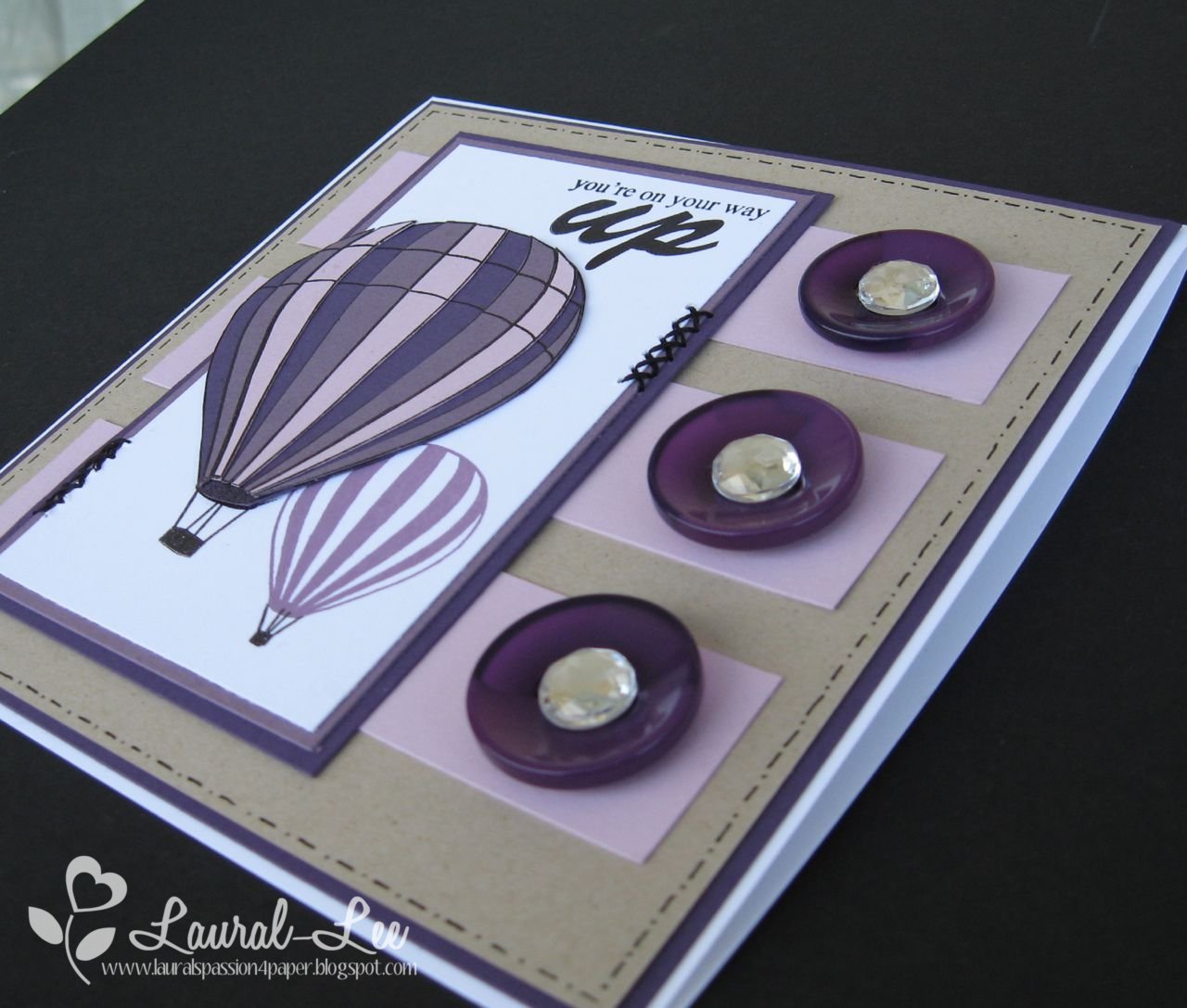
Paper: Whisper White, Elegant Eggplant, Perfect Plum, Pale Plum, Kraft
Ink: Basic Black, Pale Plum
Accessories:  Purple buttons, Rhinestones (Doodlebug), Black pen, Black thread

How Does Your Garden Grow?


Mine doesn't.  I don't have a green thumb and I haven't the patience to watch my garden grow.  The joke in our family is that you don't give me a living flower or plant...you buy them cut because they're meant to dry up and die.  My husband and my mom on the other hand are completely different and they enjoy seeing the results they get from digging in the dirt.  I dig in the dirt only to save money on the grocery bill in the summer and I pick the fruit trees to enjoy their sweetness in the winter.


Last year I took the kids to my moms place on the May long weekend to plant help plant her garden and this year they want to do it again so it seems that this will become a yearly tradition.  It's one that I'm very happy to take part in even if it is just to take pictures and watch their little faces of wonder.  We usually go back to my moms towards the end of summer and the kids get to see how big the veggies and flowers have gotten since they planted the seeds. 

This card was made using the latest CardPatterns Sketch and Garden Variety pattern paper from Cosmo Cricket.  I made this card as a thank you to my mom for her patience in teaching the kids how to enjoy digging in the dirt and appreciating the miracle of God's creation.  

Thanks so much for taking a peek and enjoy the rest of your day.

Paper:  Garden Variety (cosmo cricket), Ridinghood Red, White (PTI)
Accessories: Large corner rounder punch, Garden Variety stickers (Cosmo), Lemon tart buttons (PTI), Linen thread

April 14, 2010

Off the Wall Craftiness Challenge #2

Yesterday I had the pleasure of coming across a new challenge and thought I would give it a go.  Love the colours and the bridal theme.  The best part of all is the prize up for grabs:  May Arts Ribbon!  Have you had the pleasure of working with it?  With this project I used the May Arts ribbon I bought from Practicing Creativity Designs a while back.  Sadly they were out of this soft, easy to work with ribbon, when I put in my last order and I've used up everything I had for this big beautiful bow.  

My goal for this project was to focus on that beautiful blue colour and the softness of the bridal theme.  The  flower is layers of PTI Aqua Mist, parchment paper, the same linen ribbon, and silver fiber paper.  The Aqua Mist paper edges were distressed using my finger nails and then rolled up into a ball and flattened again to give it more dimension (like a real flower).  This is a new technique for me and I'm really happy the way it turned out. For further texture the parchment paper flower was run through my cuttlebug embossing folder as well as the white panel.  Swiss dots can dress up almost anything!  As for the bow, the ribbon was too wide but it was thin enough to fold in half and tie without being too bulky.  Those bows are getting easier to make and this ribbon is ideal.  It's got the same easy to tie quality of organza but all the possibilities of being opaque.

Ideally I would have liked to add a bit more black for more contrast but when I was done I was too worried about overdoing it and making it look too busy. The white panel should probably have been attached to a black panel.  I also took the time to try and get some new angles on my project.  I am so not a photographer but if I want my viewers to see my art in the best possible light I should probably improve my photographing skills.  This weekend I'm hoping to make my lightbox  so that I can take photos at night and next winter.  Right now I'm lucky because it's been so beautiful I can just go out to the front porch and shoot the pics there.

Thanks so much for stopping by and I hope that you've been inspired to try out this new challenge that ends tomorrow night.  Happy Crafting.

Paper: Aqua Mist (PTI), Whisper White, Silver Fiber, Parchment
Ink: Basic Black
Stamps:  Signature Greetings (PTI)
Accessories: Large corner rounder punch, Perfect polkadots ef (SU!), Swirls ef (cuttlebug), May Arts Seafoam Linen ribbon (Practicing Creativity), Black rhinestone (Doodlebug), Flower Layers die (Sizzix)

April 12, 2010

Let's Get this Party Started!!!


Good Evening my fellow bloggers?  How was your Monday?  Mine was pretty relaxed since it was an in-service day at my daughter's school and I didn't need to leave the house for anything.  I got some Laundry done, a workout in, and even a shower!!!  Not that I usually stink but showers aren't an everyday occurrence for me unless I workout.  And hey if I do stink I'm usually in my studio not bothering anyone! LOL.

Anyhow here's what I came up with the last time I was stinkin' up my studio!  I managed to come out with something fun and stylin' for the current Embellish Magazine challenge.  I struggle with layouts so FTL85 came in handy. I used the Argyle stamps from Practicing Creativity's Key to My Heart Set.  I didn't get the seems exactly right so I added some gold stickles.  Hope that doesn't break the rules of the challenge.  The challenge was to make something that reflects party and sparkles do that well don't they?  I used the SU! Snowburst set as Fireworks...again the gold sparkles helped reflect that.  The celebrate sentiment is from PTI Signature Greetings (I just masked out the "Your Day" part)

This card would make a great one for a New Year's Eve party or a Grad party. And I think it could pass for unisex.  What do you think?  It makes me want to paarrrrty!

Thanks for stopping by and enjoy the rest of your week.  I'm off with the family to look at another house.  It looks promising....

Paper: Whisper White, Kraft, Black (PTI)
Ink: Basic Black, Real Red
Stamps: Key to My Heart (Practicing Creativity), Snowburst (SU!), Signature Greetings (PTI)
Accessories: Scallop border punch, Gold Stickles, large corner rounder punch, Basic Black grosgrain ribbon


April 11, 2010

Have You Heard?...

Courtney from Practicing Creativity (PC) is looking for a 3 member design team!  It could be you!  I know I'm just creating competition for myself but hey I don't have much experience under my belt anyway and I'm hoping that Courtney finds the right team to take her venture to new heights.  

So with my PC stamps and the current Embellish Magazine challenge colours sitting on my desk I was debating what I wanted to do with them.  What can you do with red, black, white and kraft without making it look tacky?  Elegant wedding card maybe?  One of my good college friends is getting married in August and red happens to be the wedding colour.  What could I do with the Key to My Heart set that I haven't done yet?  Well here you have it.

On the white panel I lightly penciled in four squares 1 1/4" x 1 1/4" and stamped the X pattern using the scroll stamp.  I don't even think I've used that stamp yet. Be sure to use Staz On ink....it makes the erasing of the pencil marks much easier.  Then I stamped in the small red hearts.  Unfortunately the stamp set didn't have the right sentiment for a wedding card so I had to dig into my stamp box.  The large scallop is made with the PTI die.  The fantastic thing about this die is that it doesn't matter what side of the paper you cut, both sides have the same smooth cut. No good or bad side.

Anyhow, I hope you've been inspired to show off some of your Creativity to Courtney.  Have a fabulous Monday and be sure to check back to see my actual entry for the Embellish Challenge.  This was just a warm up.

Paper: Kraft, Whisper White, Black (PTI)
Ink:  Staz On Black, Real Red, Basic Black
Stamps: Key to My Heart (Practicing Creativity), Whimsical Words (SU!)
Accessories: Real Red satin ribbon, Large scallop die (PTI)

Visitors